Desktop Messaging Surfaces
The following messaging surfaces are currently remotely available in Firefox Desktop, meaning that you create new messages without shipping code changes.
Doorhanger
Doorhangers, also known as Contextual Feature Recommendation Panels, are anchored to a UI element such as the application menu, the identity panel, the Firefox View tab, and so on. They can include a configurable icon beside the title. Doorhangers do not reappear once the primary action button is clicked, irrespective of any frequency caps on the message. Clicking the primary button adds the message id to a block list and its messaging system impression are cleared.
Feature Callouts
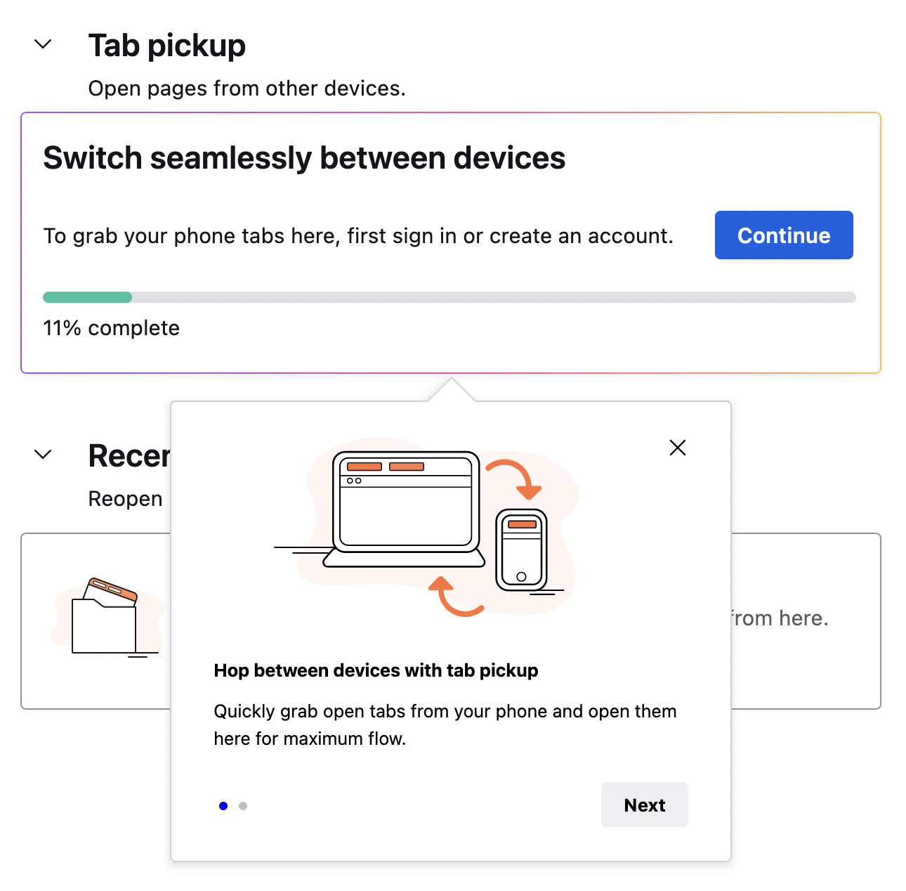
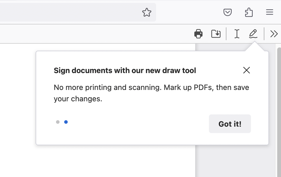
Feature Callouts point to and describe features in content pages or the browser chrome. Multiple messages can be used to create feature tours. The callout element is embedded in the page content and does not block other interactions. Callouts may be configured with a primary action and an optional dismiss button. The arrow can be positioned in the middle of one of the callout’s sides or either of its top corners. This surface is currently only available for Firefox View and the PDF viewer.
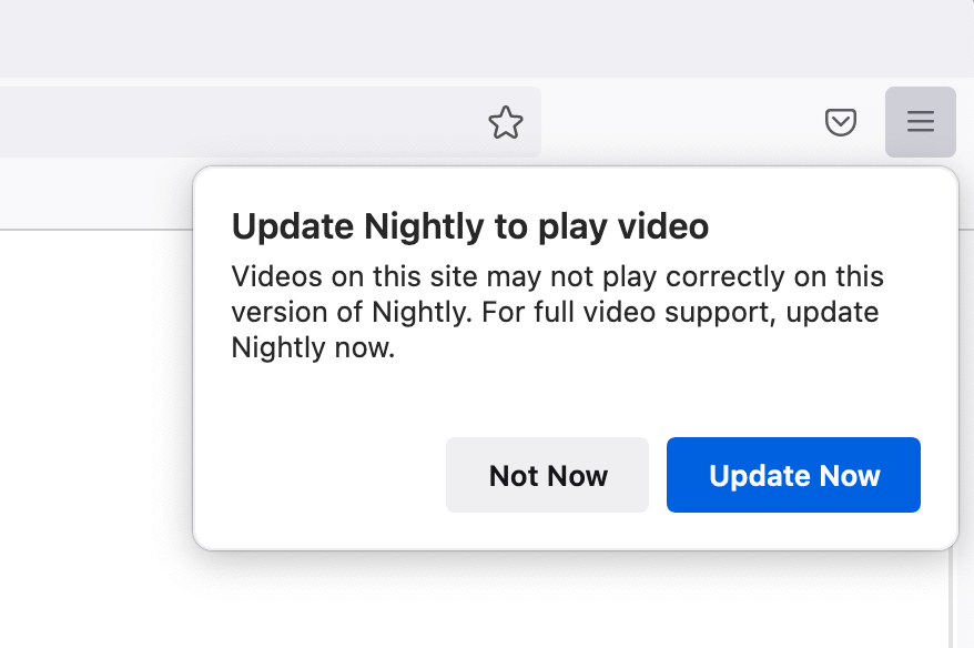
Infobar

Shown at the top of browser content area, these can be per tab (switching tabs hides it) or global (persistent across tabs).
Moments Pages
This type of message is a URL that the browser will open at the start of the browsing session and will focus on that tab. These pages appears on start-up as a full content page.
PrivateBrowsing
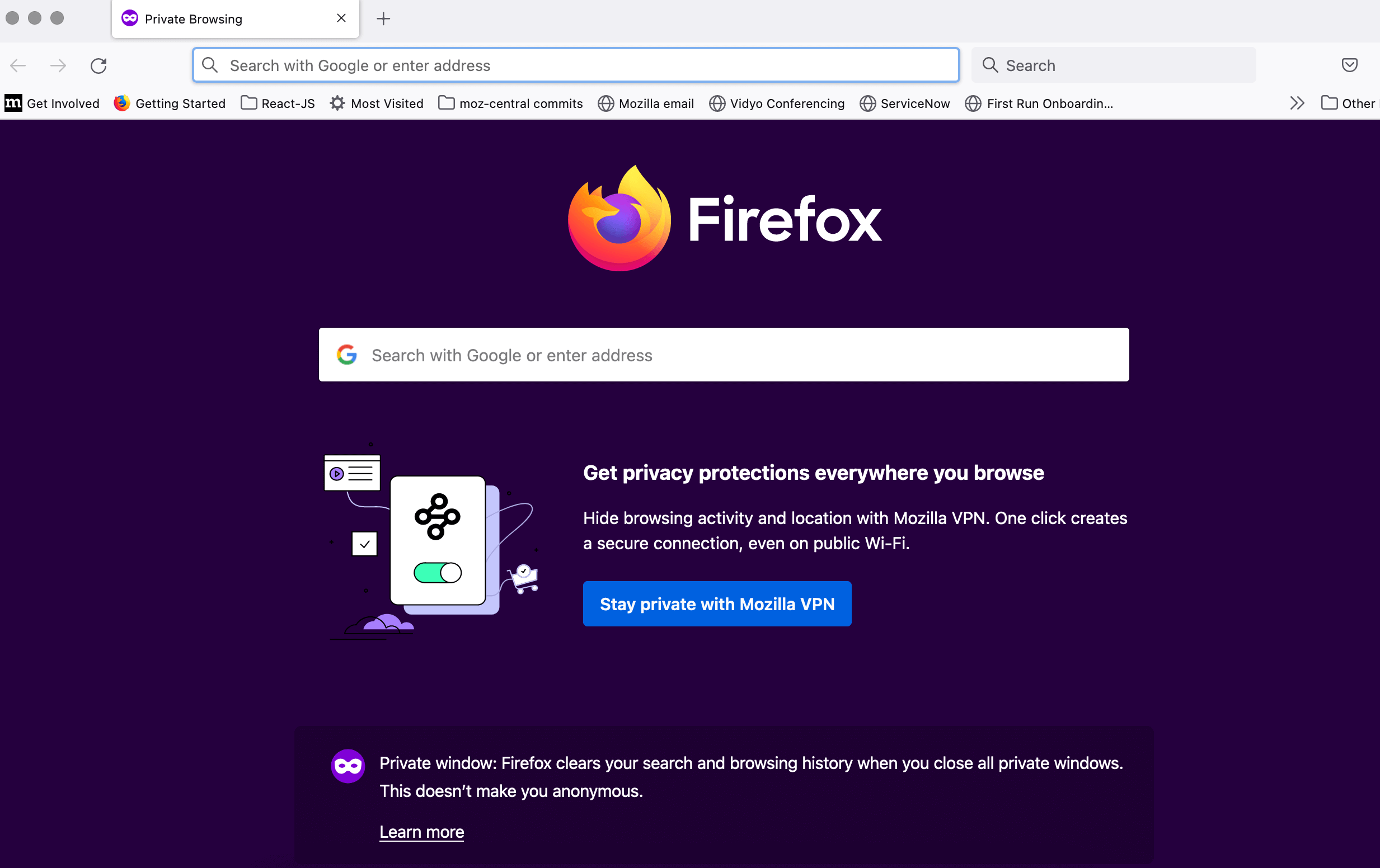
Messages shown inside about:privatebrowsing content area when new private window is opened.
Snippets

Short messages that appear on New Tab Page to highlight products, features and initiatives
Multistage Spotlight
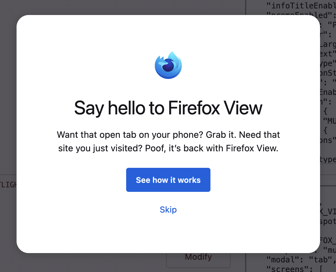
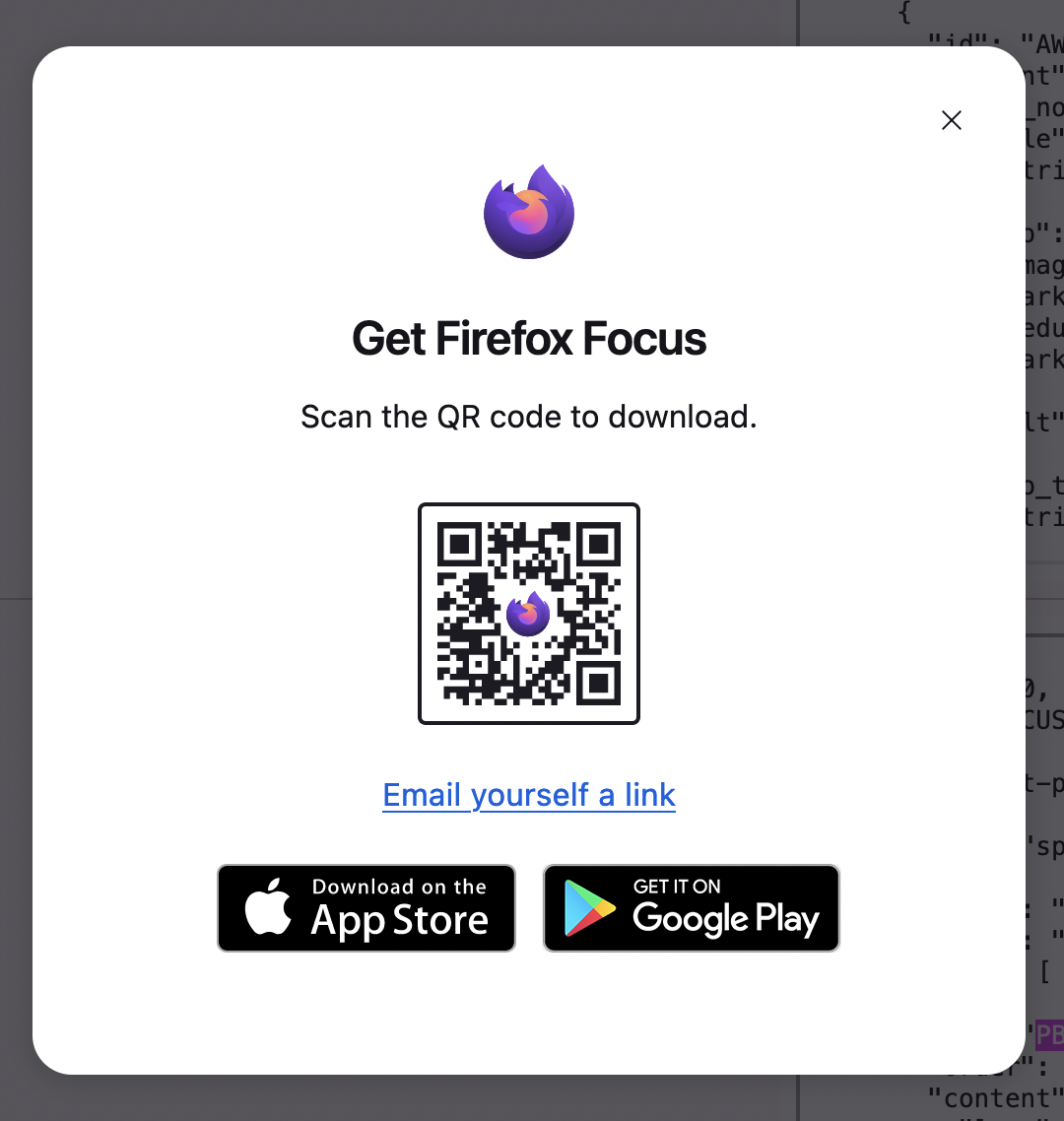
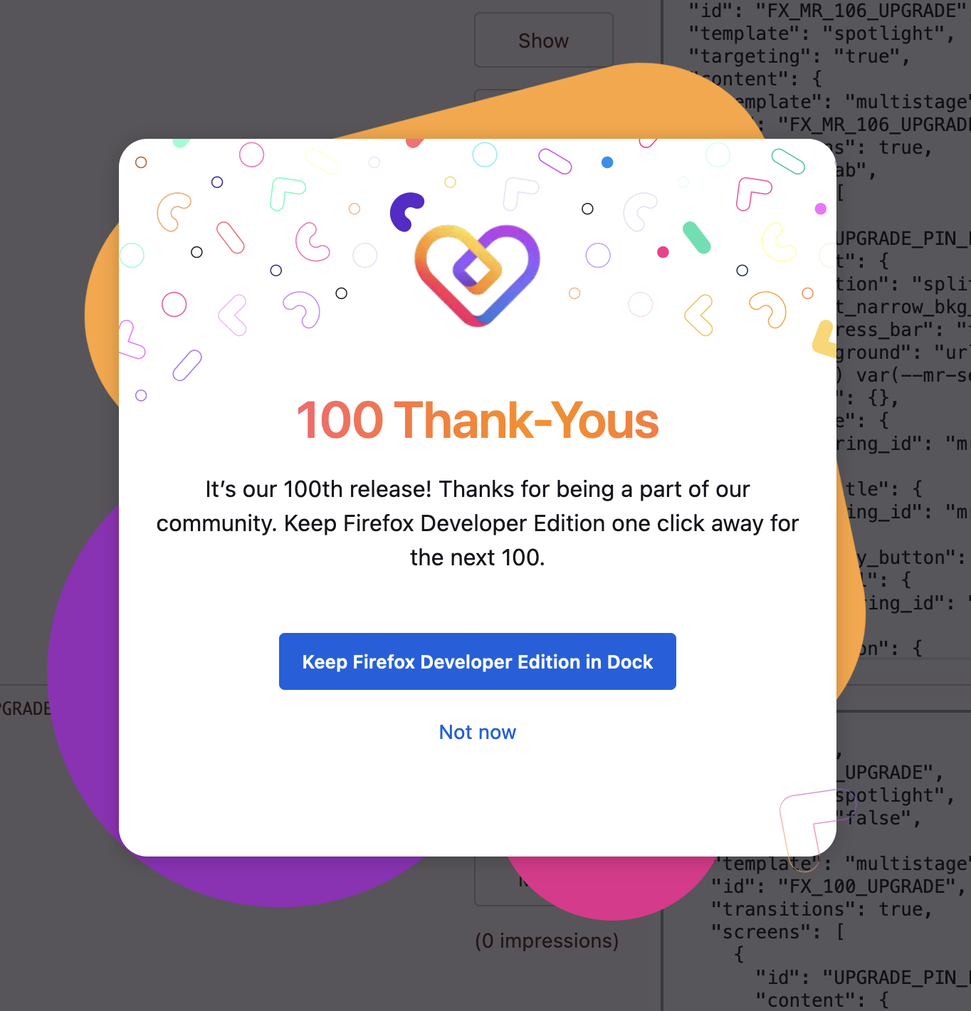
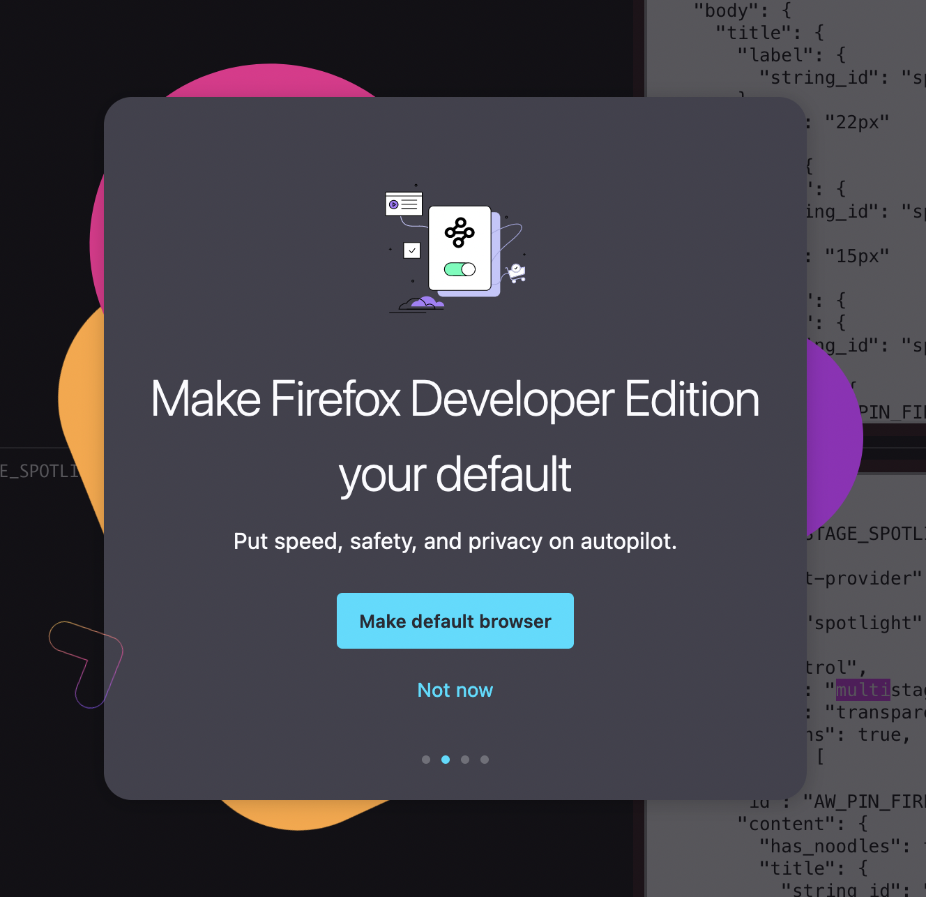
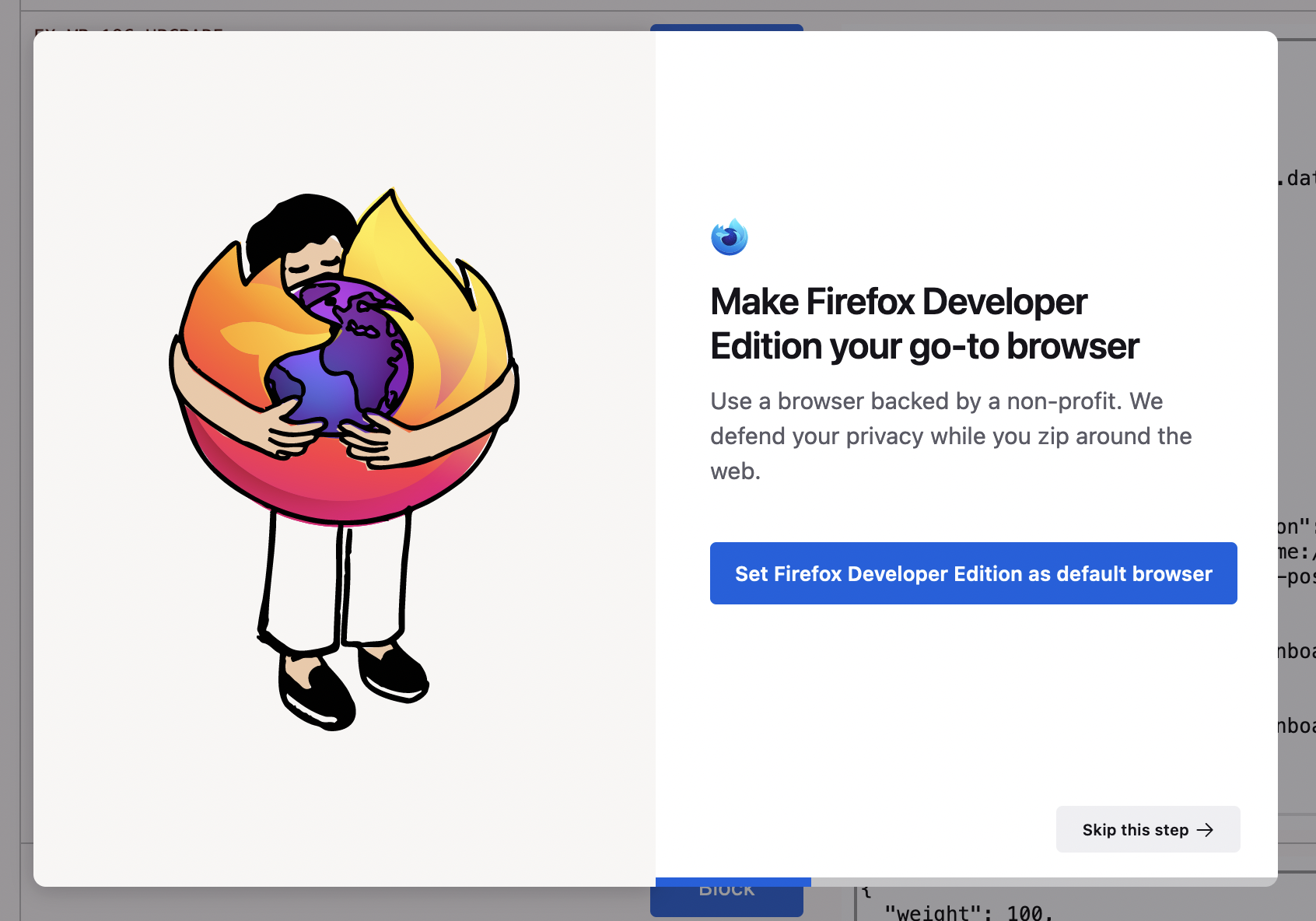
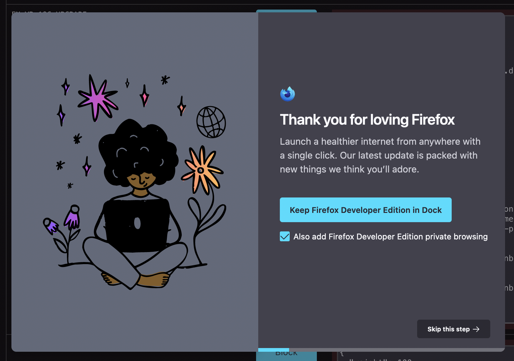
This surface can be configured as a window or tab level modal, and all other interactions are prevented. The modal's configuration is highly flexible and may include primary and secondary actions, a logo image, background, dismiss button, localized app store icons, QR code with associated link, checkboxes, decorative noodles, and more. A given message may be configured with multiple screens. Progress through these screens may be displayed as a step indicator or a progress bar. Each screen can use a centered, single panel layout or a split screen layout with an image and/or hero text on one side and all other modal content on the other.